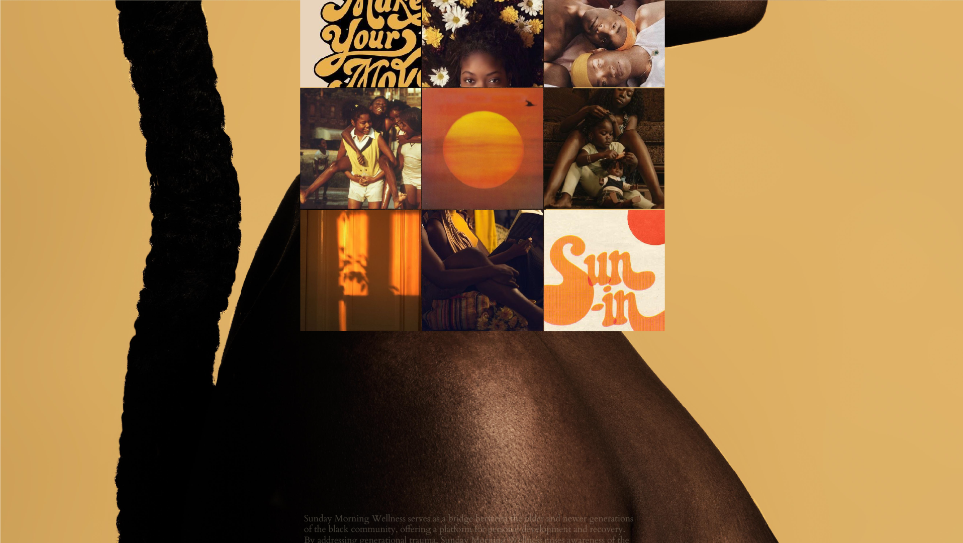
Client: Google
Project Title: The Black Googler Network – Employee Resource Group Redesign
Role: Brand Designer
Credits: Co-Graphic Designer Joiya S.
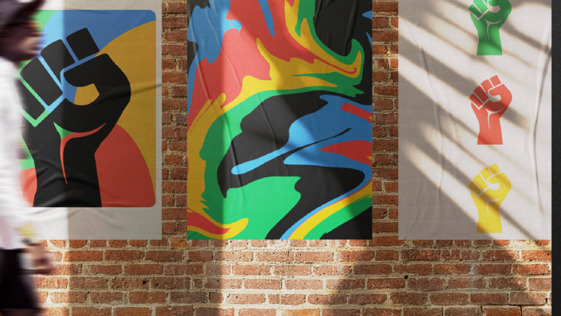
Project Overview/ Goals : Google’s Employee Resource Group, The Black Googler Network needed a brand lift. As an impactful resource to Google, it was a key business goal of the global team to create an information hierarchy to increase participation and user engagement while showcasing the group's impact toward world change.
A bit of the work had been outdated and it was time for something new.
In discovery, we knew that it was important to use pieces of the existing brand to ensure familiarity but urge an easily identifiable enhancement. It was essential to symbolize messaging that conveys connection, togetherness, growth, and vibrancy. With the nuances and changes we developed a useful brand guideline showcasing the new scope of the brand, and an organized user overview.
Pain Points: Lacks of participation, outdated assets and identity.
Deliverables: Brand Strategy and Identity, Pattern, Iconography, Medium-Fidelity Internal Web Page Templates
Primary Tools & Skills Used: Adobe Creative Suite (Photoshop, Indesign, Illustrator, Lightroom), Procreate, Figma, Layout Design
**Please note that due to confidentiality some parts are not shown.
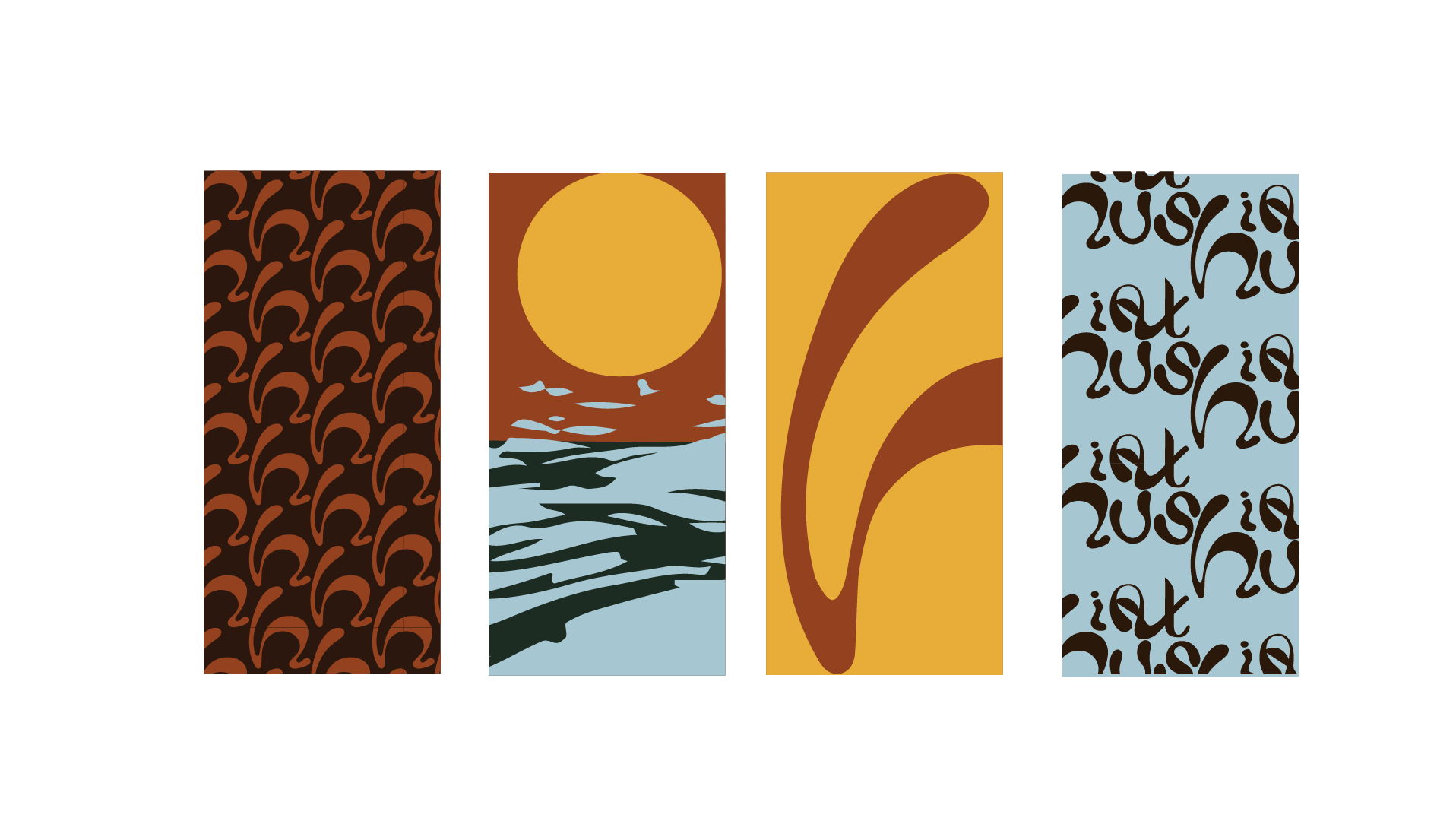
Client: Florida A&M University, c/012
Project Title: 12A&M
Role: Multi-Medium Brand Designer
Credits: Project Managers Jaya M. Kayla M. Kierra H. Khambrel S. Copywriter. Marisa R. Social Media Manager Imir Hall.
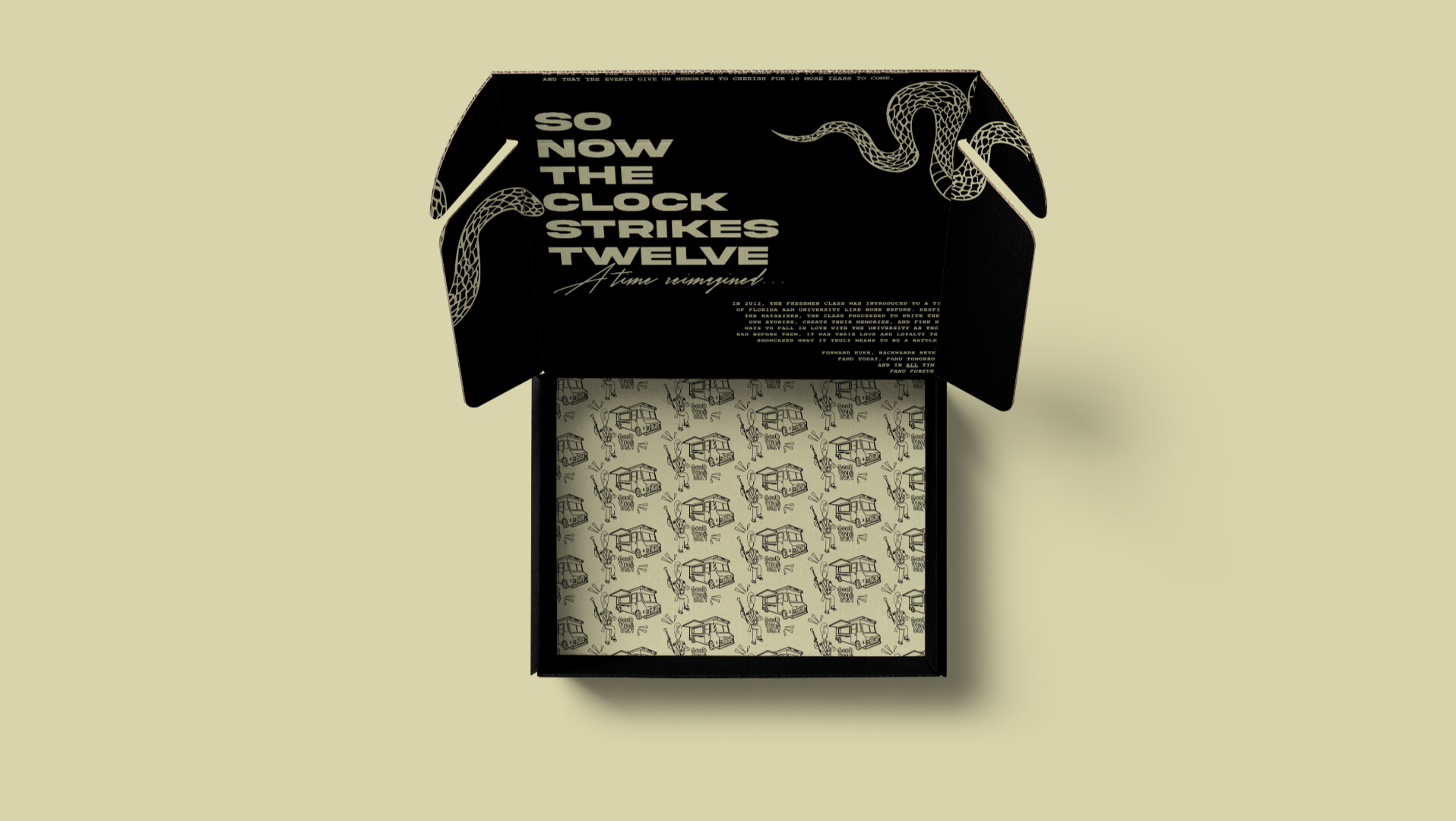
Project Overview/ Goals : A collegiate team needed to source a designer to create across several mediums. The goal of the project was to build awareness of Product – Homecoming in a Box and promote fundraising efforts for the university. The duration of the project was lengthy (6mo) due to so many moving parts. It was nice to lead and steward creative brand direction from strategy to implementation.
The tone of the branding needed to feel nostalgic and fun to the ℅ 2012. It was imperative for the branding to feel personal and easily connectable with class. From the bold typography used in social networks during that time or places on campus that were used as co-ed hangouts. All were essential to the research for the project.
The school colors are Orange and Green, so I matched several palettes to see which would be the boldest hues and best eye-catching saturations. After hours of blending and color matching the color palette was formed and used throughout the creation of all assets.
The apparel and swag were all handcrafted illustrations of various connections to the class such as the school mascot (Rattler), The drum major pattern from the well renowned band, Food Trucks from the parade of Homecoming Food Trucks and so on.
Pain Points: Lack of awareness.
Deliverables: Brand Identity, UI Design (Landing Web Page with E-Commerce Store), Social Media Content Creation, Experiential Assets, Packaging Design with Patterns & Illustration, and Swag/Apparel.
Primary Tools: Adobe Creative Suite (Photoshop, Indesign, Illustrator, Lightroom), Procreate, Figma, Layout Design
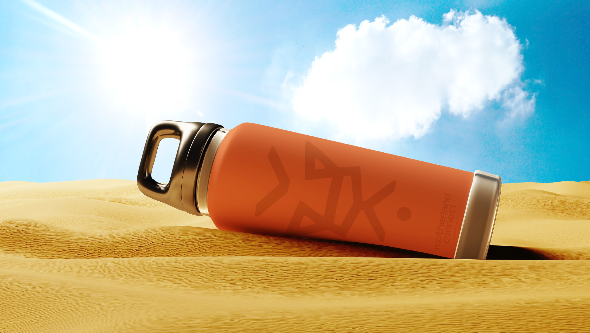
Motherland Connection approached me seeking a brand transformation. Together, we crafted an entirely fresh brand identity, complete with a comprehensive brand guideline, a captivating logo package, an engaging color palette, eye-catching packaging designs, and a dynamic website. This comprehensive overhaul not only led to a substantial surge in sales but also, most importantly, instilled a newfound confidence in the brand's direction. Motherland Connection now possesses a profound grasp of its core values, a clearly defined mission, and an intimate understanding of the precise audience it seeks to connect with.
Year: 2022
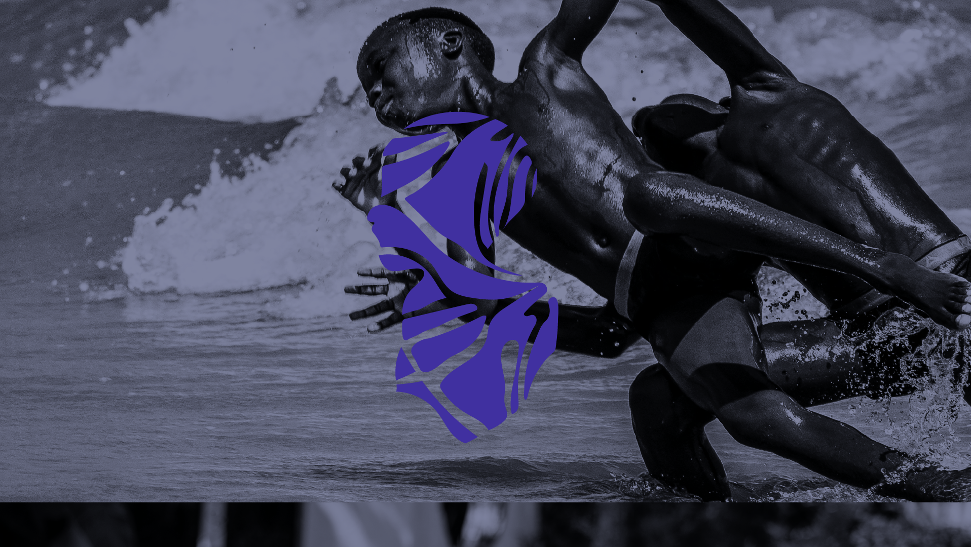
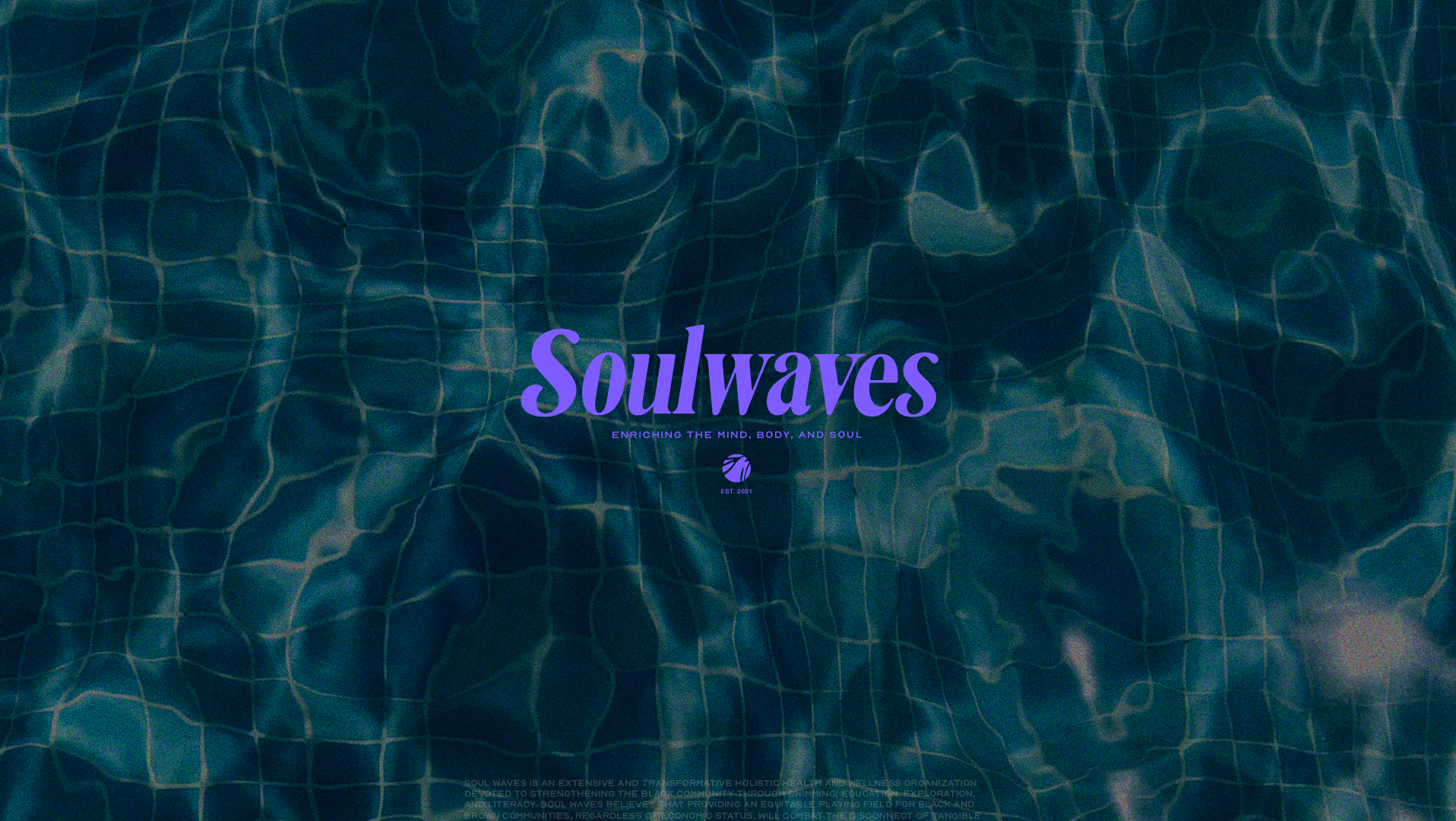
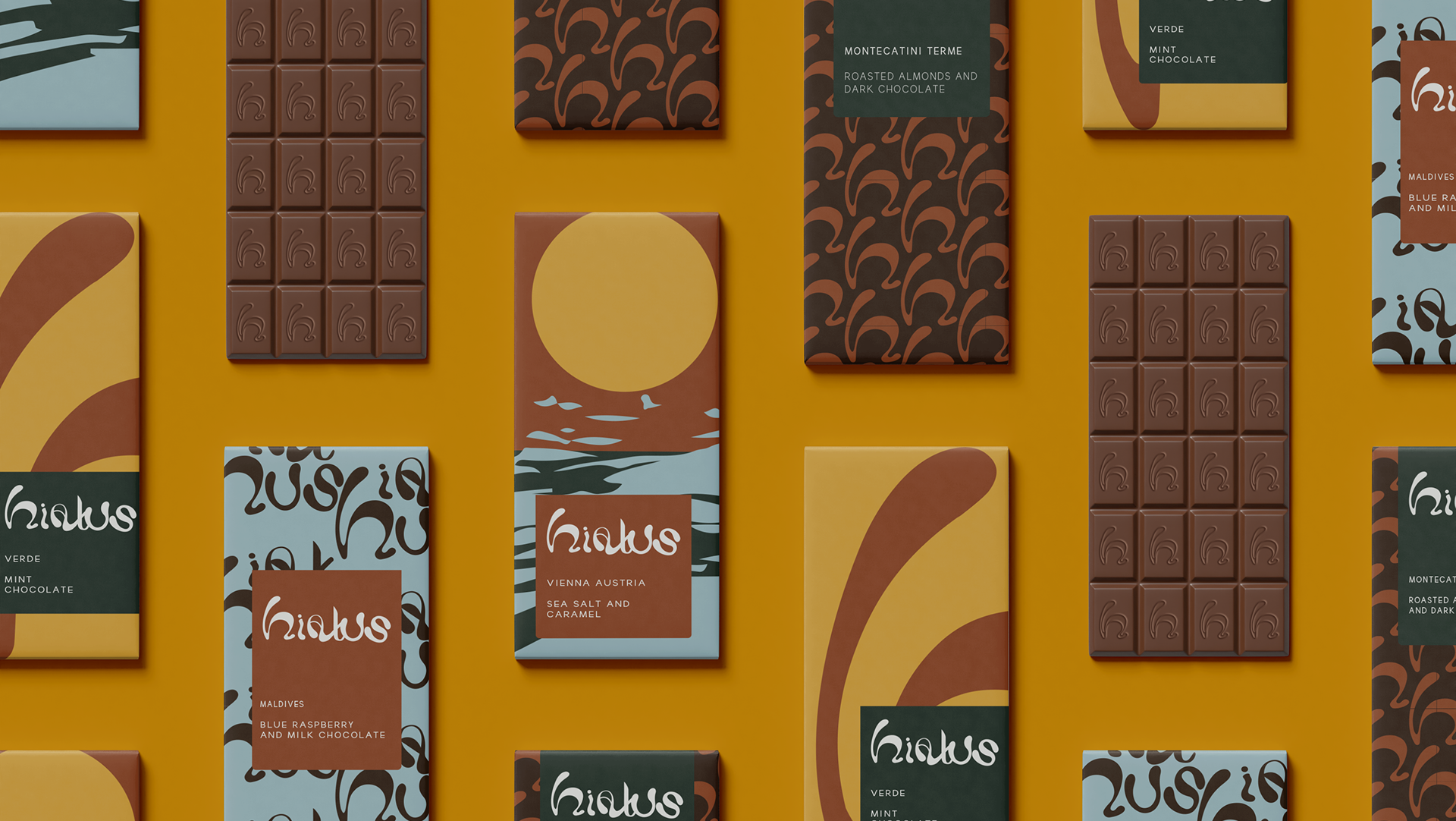
Client: Hiatus Chocolate Company
Amid the relentless challenges of a pandemic, the art of escapism became increasingly elusive. Juggling remote work and the demands of new motherhood, women found precious little time to unwind and de-stress. Hiatus Chocolate Company was conceived as a sanctuary, a respite that allows women to steal a brief moment of solace in the form of a single bite of a decadent chocolate bar. In response to this unique vision, I was enlisted to craft a holistic brand identity, provide art direction, and create compelling illustrations that would form the heart of the brand's essence.
The chocolate bars, affectionately named after some of the world's most serene and idyllic locations, are complemented by a carefully curated color palette. This palette was designed to evoke warmth and a sense of support, ensuring that the brand's visual identity struck the perfect balance between sophistication and approachability, avoiding any hint of playfulness or frivolity.
The essence of Hiatus Chocolate Company is a profound belief that women deserve moments of respite without guilt. These women adore their lives but crave those precious seconds to catch their breath, and Hiatus is here to offer them just that.

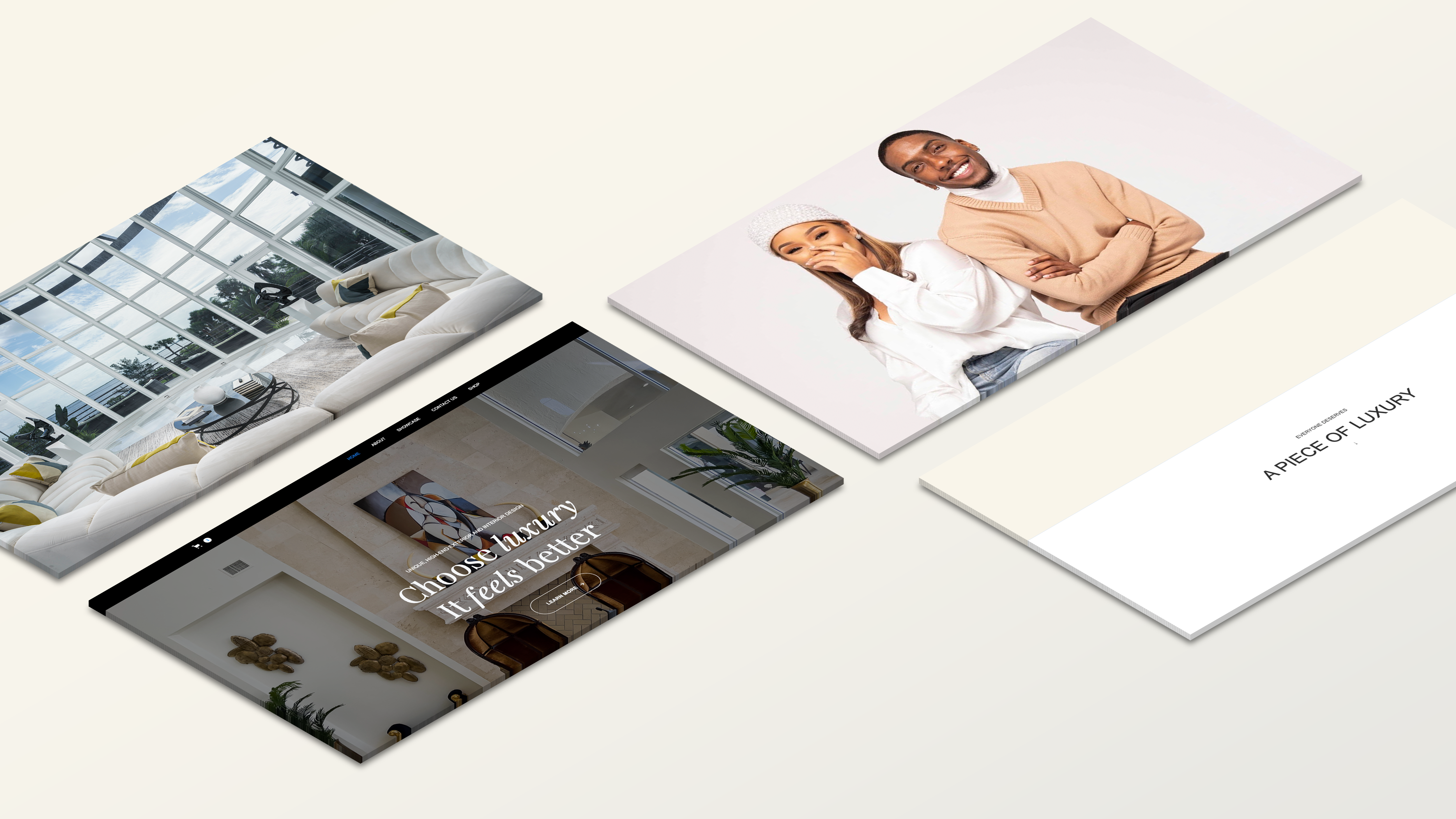
Client: Ayee Interiors
Project Title: Web Design for Interior Design Company
Role: UX/UI Web Designer
Credits: Ayee Interiors Internal Photographer
Project Overview/ Goals : Launch of Pillow e-commerce Store. Drive Traffic and increase conversion for sales
Pain Points/Problem: Client wanted to create a e-commerce store to increase conversion rates and ensure the user shopping experience was easily accessible and simple to use
Deliverables: Low-Fi, High-Fi Fidelity Wireframe, Figma Prototype, Full Design Webflow Ecommerce Site
Primary Tools: Adobe Illustrator, Webflow, Adobe Photoshop, Figma, Procreate/Sketch
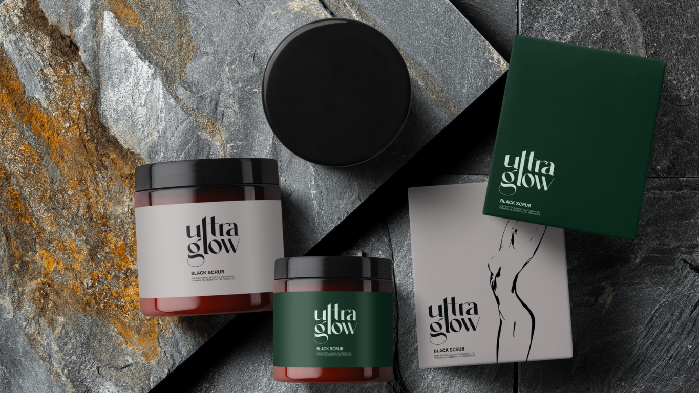
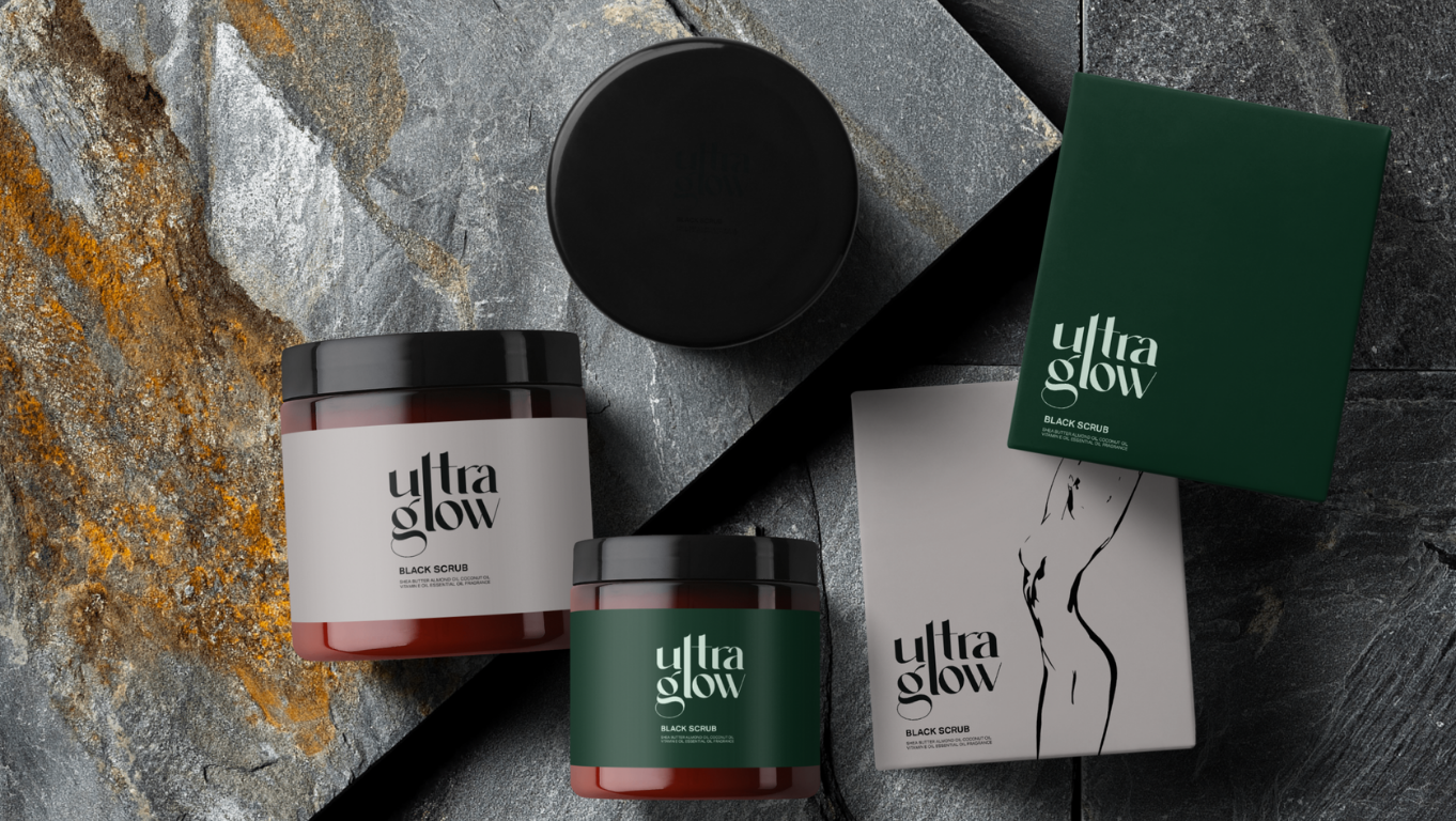
Client: Official Ultra Glow
Project Title: Luxury Organic Skin Care Design and Logo Redesign
Role: Brand and Packaging Designer
Credits: Photographer Stockx, Ron Lach
Project Overview/ Goals : Ultra Glow is a non-invasive and comprehensive full service unisex beauty spa. Since starting and expanding her South Florida clientele, the client developed a line of organic skincare products to use throughout her services.
With discovery, it was clear that the goal of the project was to create a captivating luxury experience for the product. Although the client wanted a standout approach, she wanted to keep the brand minimalistic and very clean for her targeted audience.
After completing a competitive analysis, it was clear that other brands steered to more of a plant-forward design approach. Several companies used plants/flowers and lighter greens to convey the use of organic products rather than bodies and/ bold colors.
With this knowledge I created useful mood boards of movement and body positivity. For color I challenged the idea of deep greens, creams and blacks which contrasted well together, and gave more of a high-end encounter; perfectly gauged for the targeted audience.
Pain Points: Although the brand held a reputable existing brand name it lacked identity and exposure. The client felt that before presenting the products to market it was imperative to create a cohesive design to match the quality of the product.
Deliverables: Brand Identity Guideline, Logo Suite, Product and Packaging Labels
Primary Tools: Adobe Illustrator, Artboard Studio, Procreate, Color Theory, Typography
Year: 2022
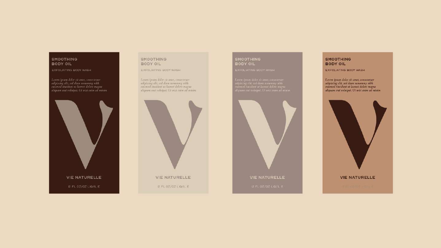
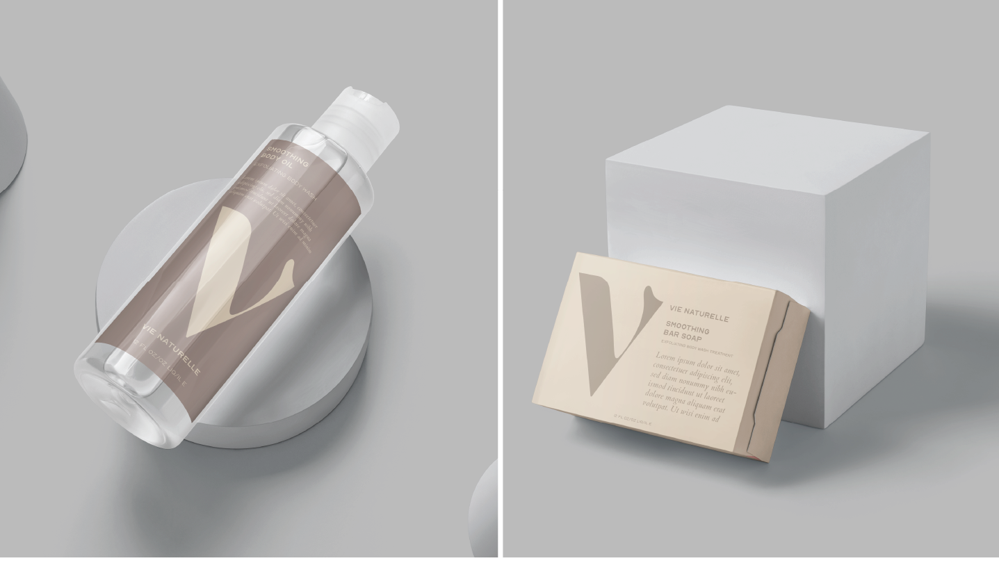
Client: Vie Naturelle
A dedicated client, in collaboration with a registered nurse, embarked on a mission to introduce a line of sensitive cleansers and beauty products aimed at fostering healthier vaginal health and sparking essential conversations surrounding this topic in underserved communities. In response, we undertook the challenge of crafting a new brand identity, designing innovative packaging, and formulating an effective content strategy, all with the overarching goal of reaching a broader audience and achieving a remarkable 30% boost in sales.
Our primary objective was to develop a product line that resonated with the need for discretion, especially for its discerning clientele. It was crucial to present product information in a manner that not only educated but also respected the privacy and comfort of our buyers. To achieve this, we curated a color palette featuring neutral tones, adopted clean and legible typography, and designed aesthetically pleasing packaging to ensure a user experience that aligned with our discreet yet informative approach.